A 5-week visual design project for our senior experience design class, with the end goal of creating a visual identity that translates into an expressive microsite for our assigned client, Dutch string orchestra Amsterdam Sinfonietta. This was achieved through extensive study of our precedent graphic designers to help to ground our process and experimentations.
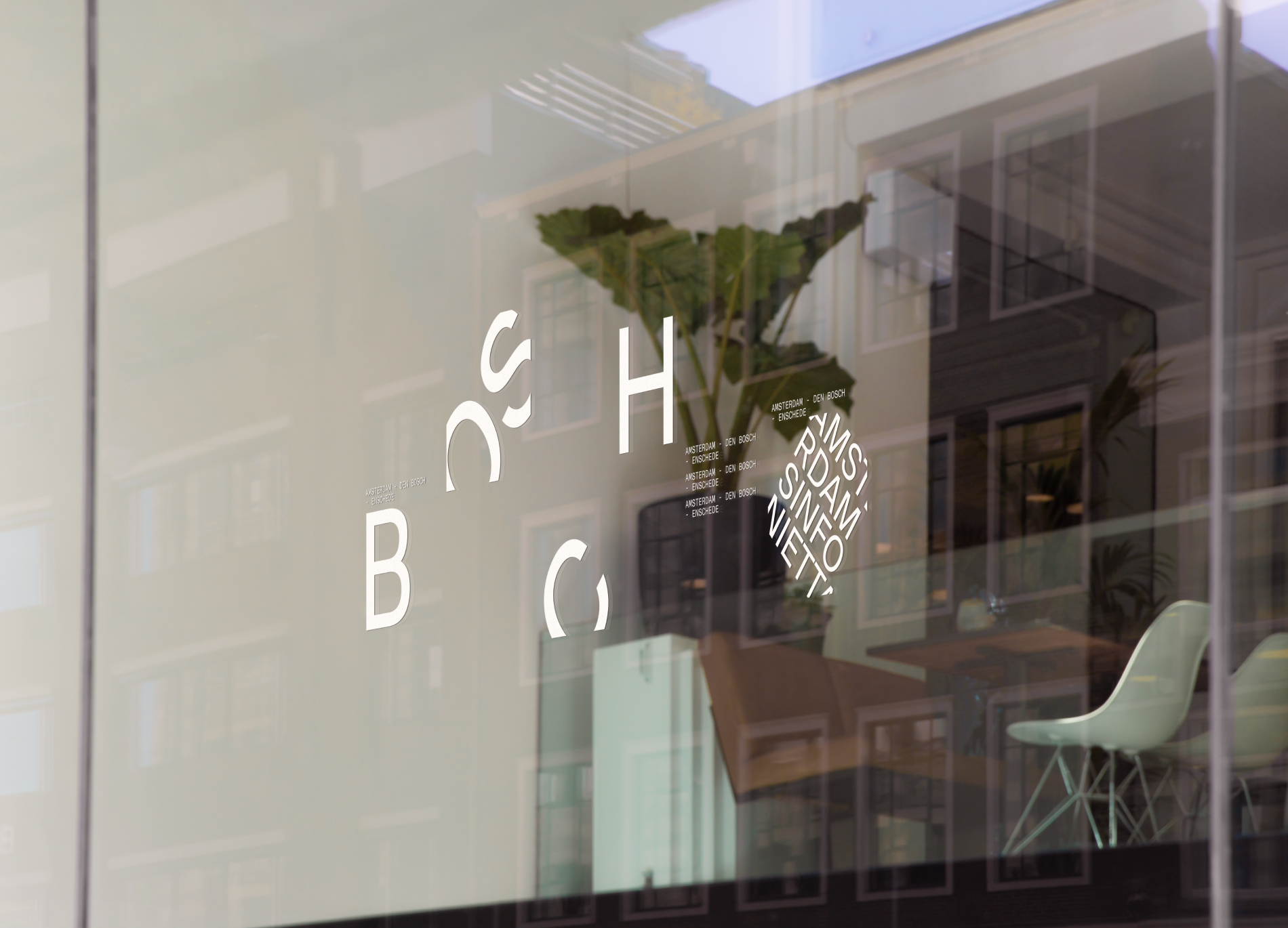
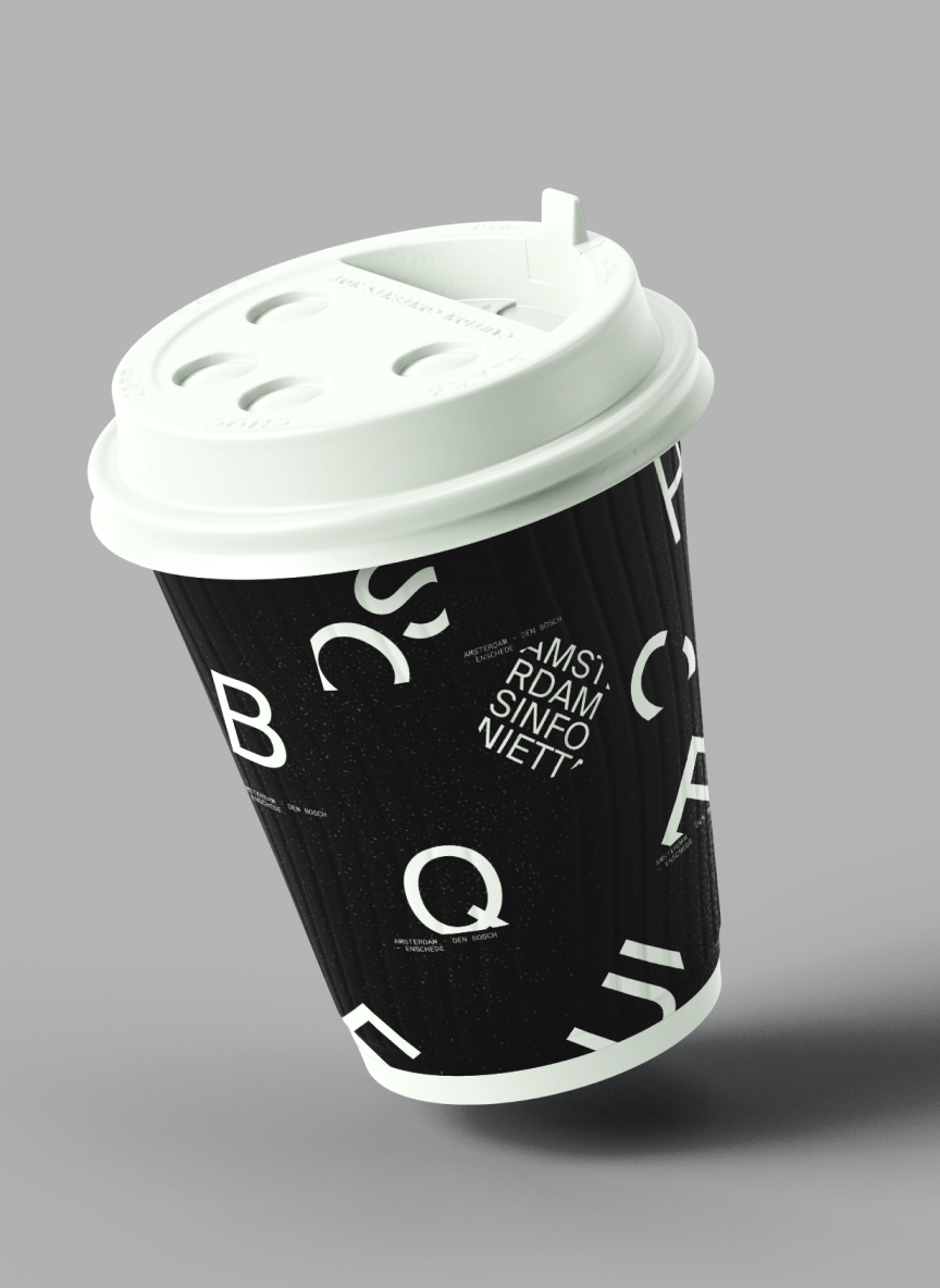
A new Bosch Requiem had been performed annually since 2016, to commemorate the legacy of the passing Dutch painter, Hieronymus Bosch. We created an expressive microsite dedicated as a pre-purchase medium for their 2022 concert, performed by Amsterdam Sinfonietta.
We began our exploration by analyzing Wolfgang Weingart's work and adapting Ellen Lupton's design principles. Weingart's work relies heavily on how to use and break the rules and the rigidness of Swiss Designs that initially follows a strict principle in Grid, Typography, and Negative Space. Our main focus is to see how far the qualities of Swiss Designs can be pushed and still retain their purpose. We gathered a few approaches to guide us during our experimentation process:
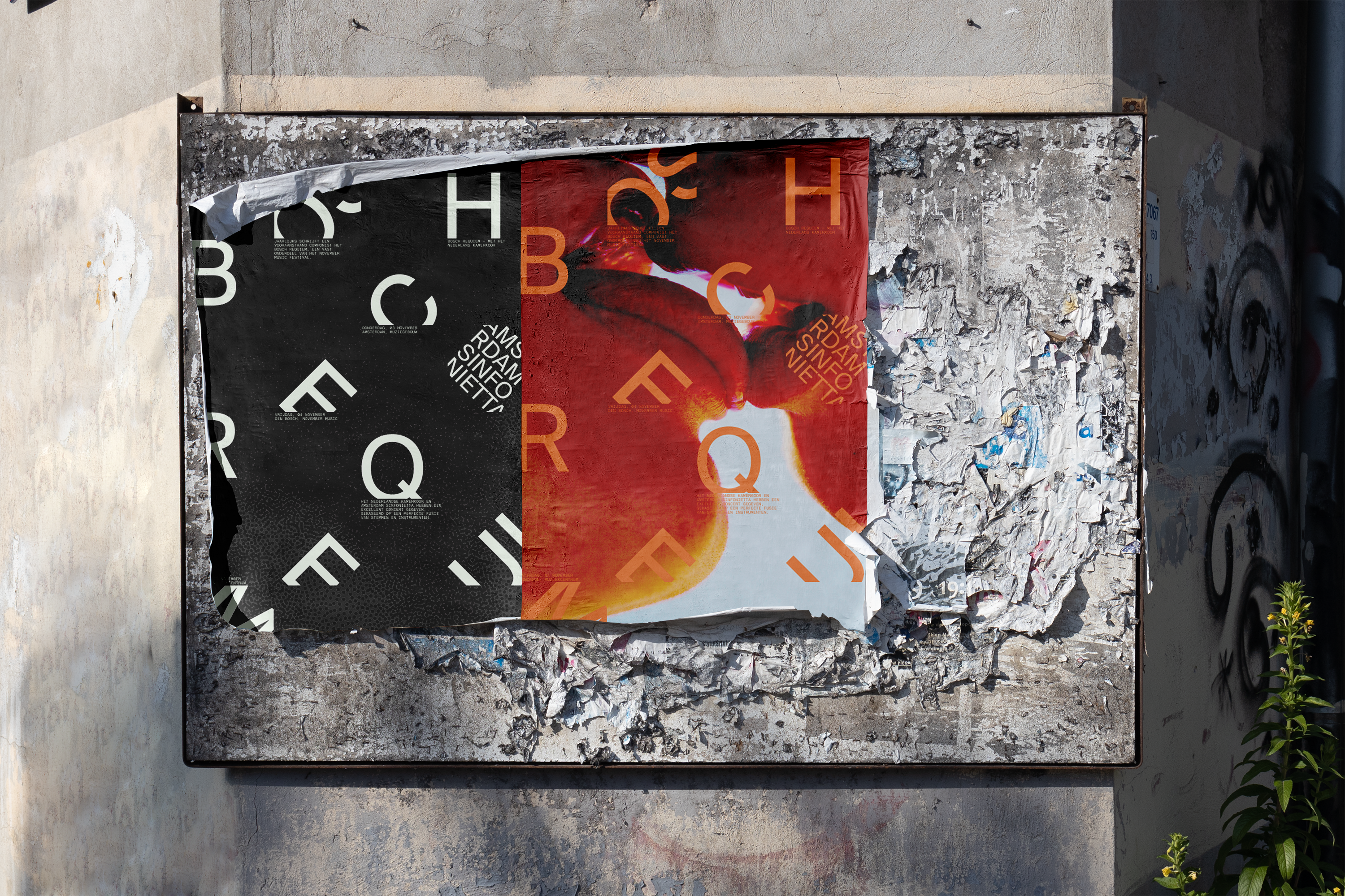
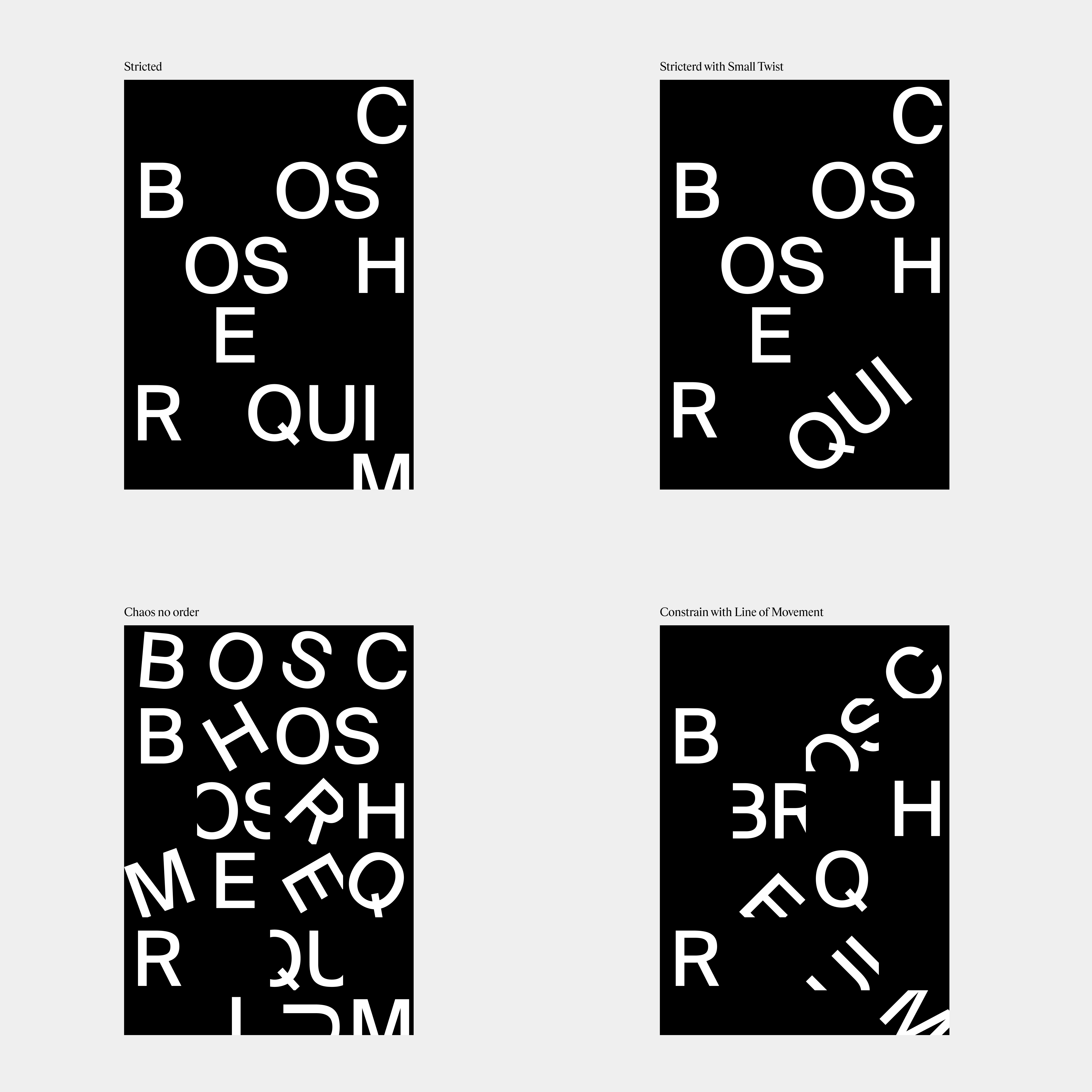
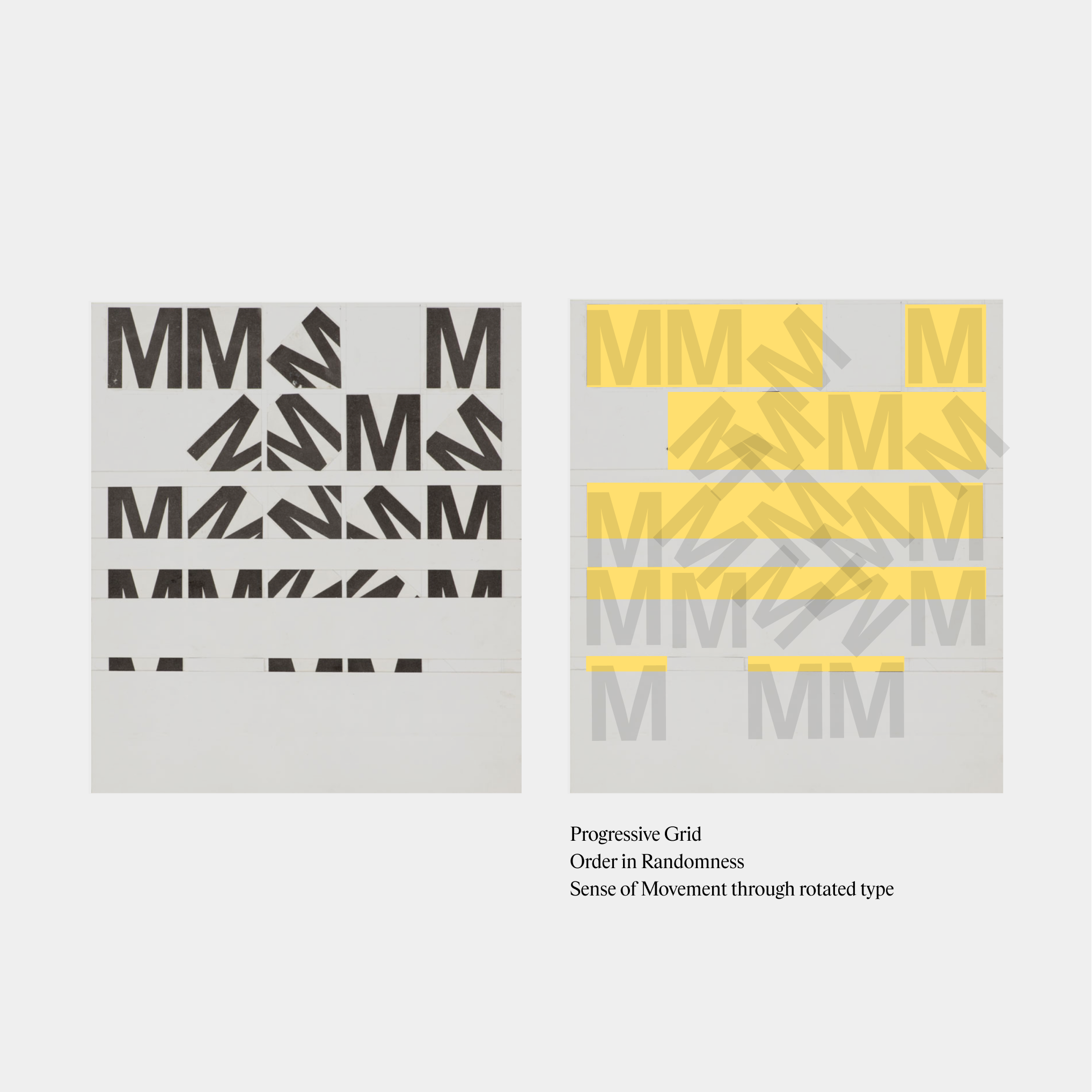
Creating a sense of movement by rotating and cropping typographic elements, resulting in a composition that feels dynamic while also challenging the readability of text.
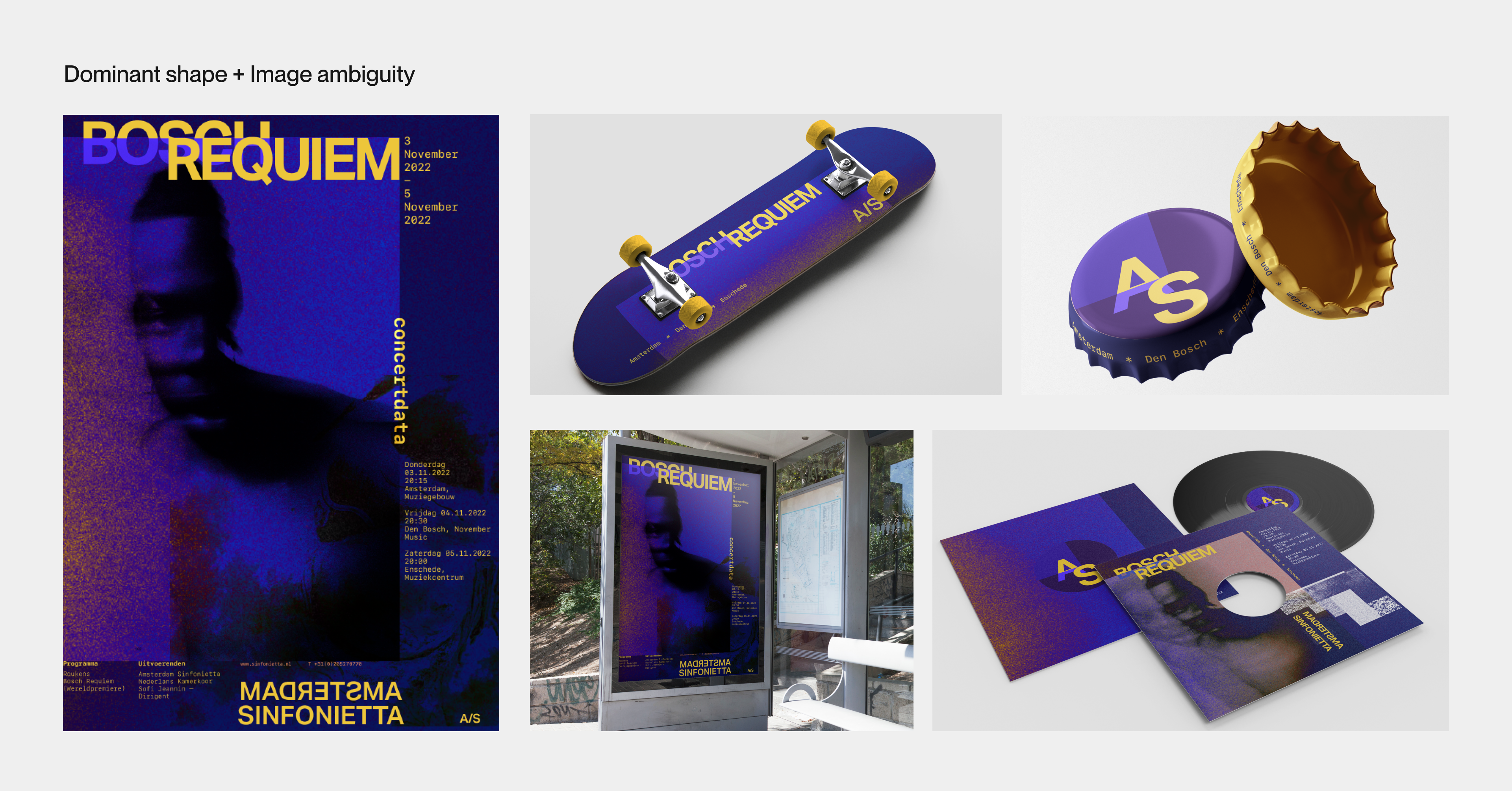
Brings order to collage compositions through utilization of a large, prominent shape to anchor smaller text and shapes.
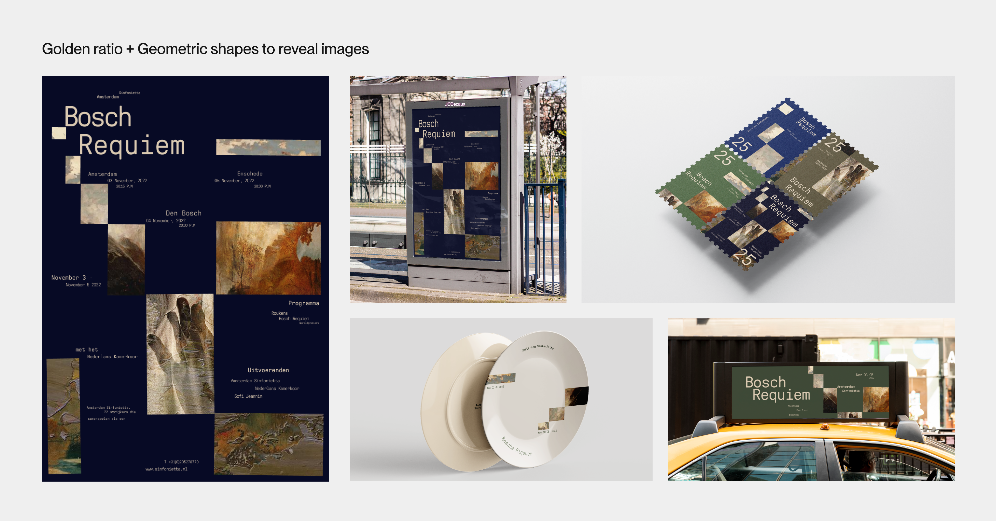
Using geometric shapes to frame and reveal images challenges the viewer’s comprehension to capture and maintain their attention.
Layer styles such as lighten, difference, overlay, hard light and colour burn are used in conjunction with textures to manipulate clear perception of an image.
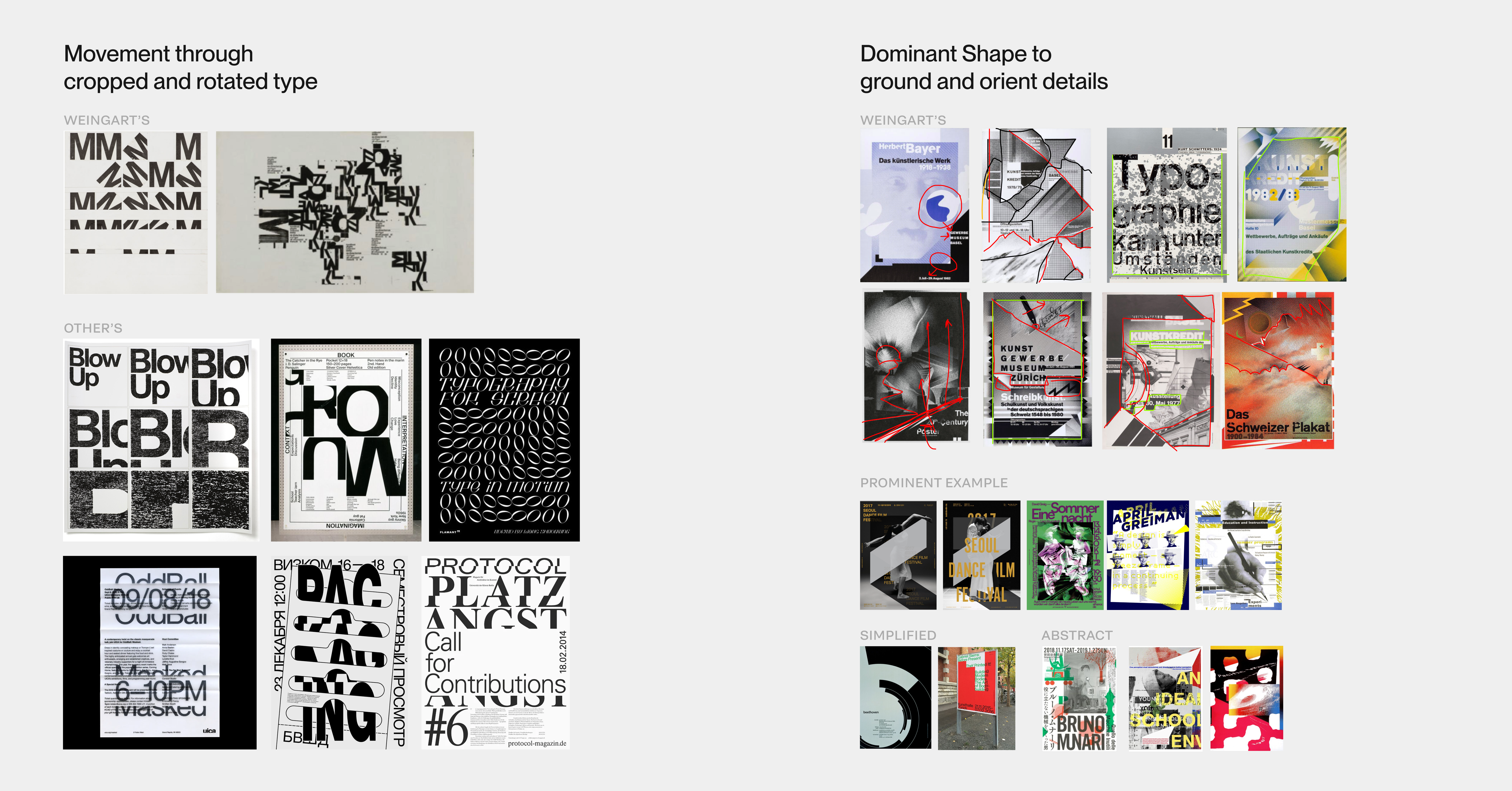
We drew inspiration from renowned precedent designers and applied their principles and qualities to develop three distinct approaches.
The first approach employs dominant shapes to anchor all elements within the poster. We utilized image distressing techniques to evoke ambiguity, engaging the audience's perception.
In the second approach, we delved into the application of the golden ratio within a modular grid. By strategically placing elements and framing images in geometric shapes within the grid, we gradually reveal the image as a captivating whole.
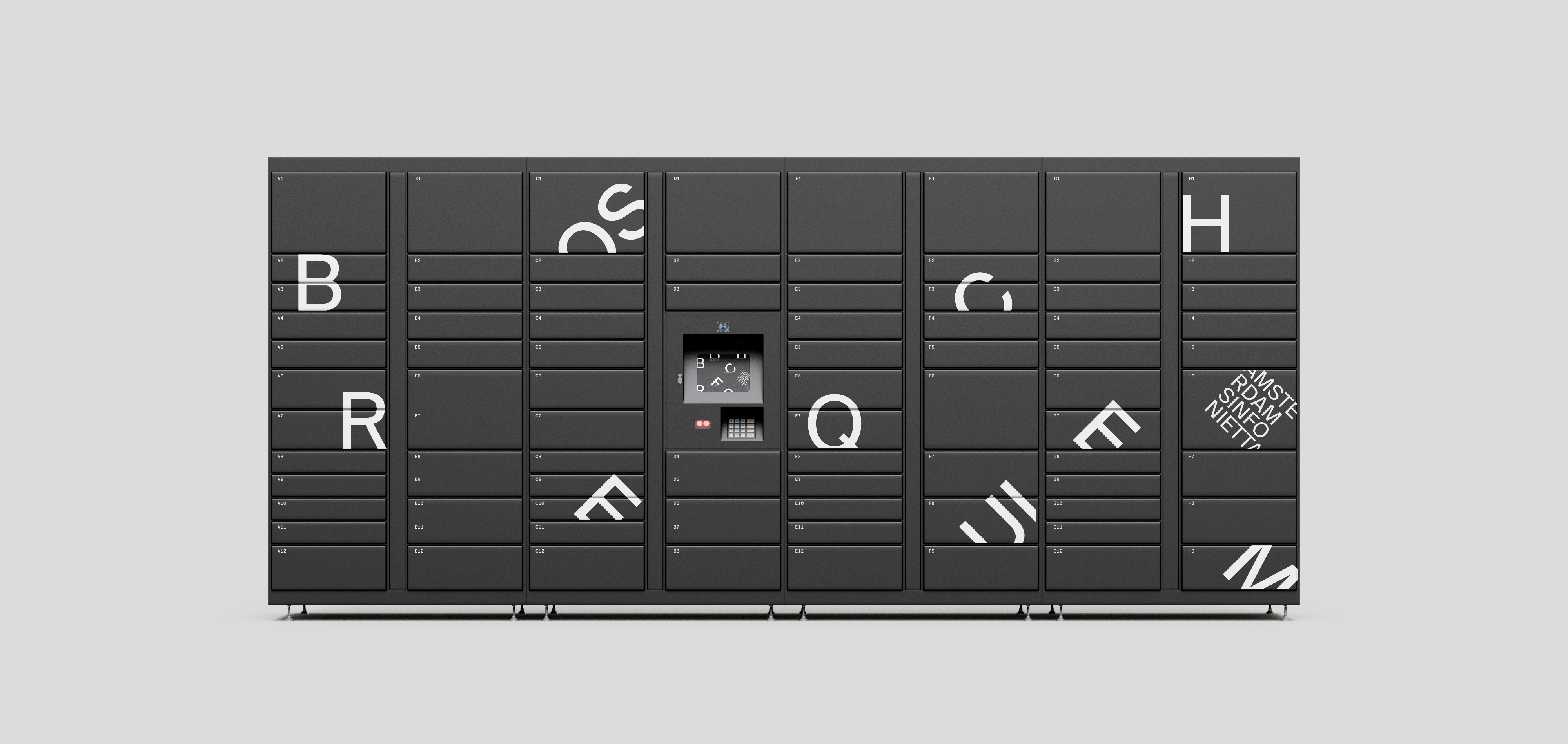
The third approach emerged from an in-depth study of Weingart's letter 'M' exploration. Using cropped type letters rotation to create lines of movement.
I led my team in analyzing our precedent designer's work starting from breaking down Weingart's Letter M Study, along with Dan Friedman's Rythm study to achieve a pleasant composition through randomness. Through the process, I also kept in mind focusing more on challenging the legibility and relationship between text through contrast type scale.
We designed a strict grid system as the foundation for our third poster, allowing elements to establish a harmonious visual relationship. To reinforce the structure, we opted to pair a grotesk font with a monospaced that possesses its own systemic flow beneath each type. I took on the responsibility of research various typefaces and their attributes to guide the font pairings for the team.
To test out the flexibility and effectiveness of this art diection before implementing it in the microsite, we applied our designs to diverse physical assets, ranging from larger formats to smaller ones. After the consideration, our team decided to proceed with this direction due to its adaptability and we felt it would best translates into the microsite.
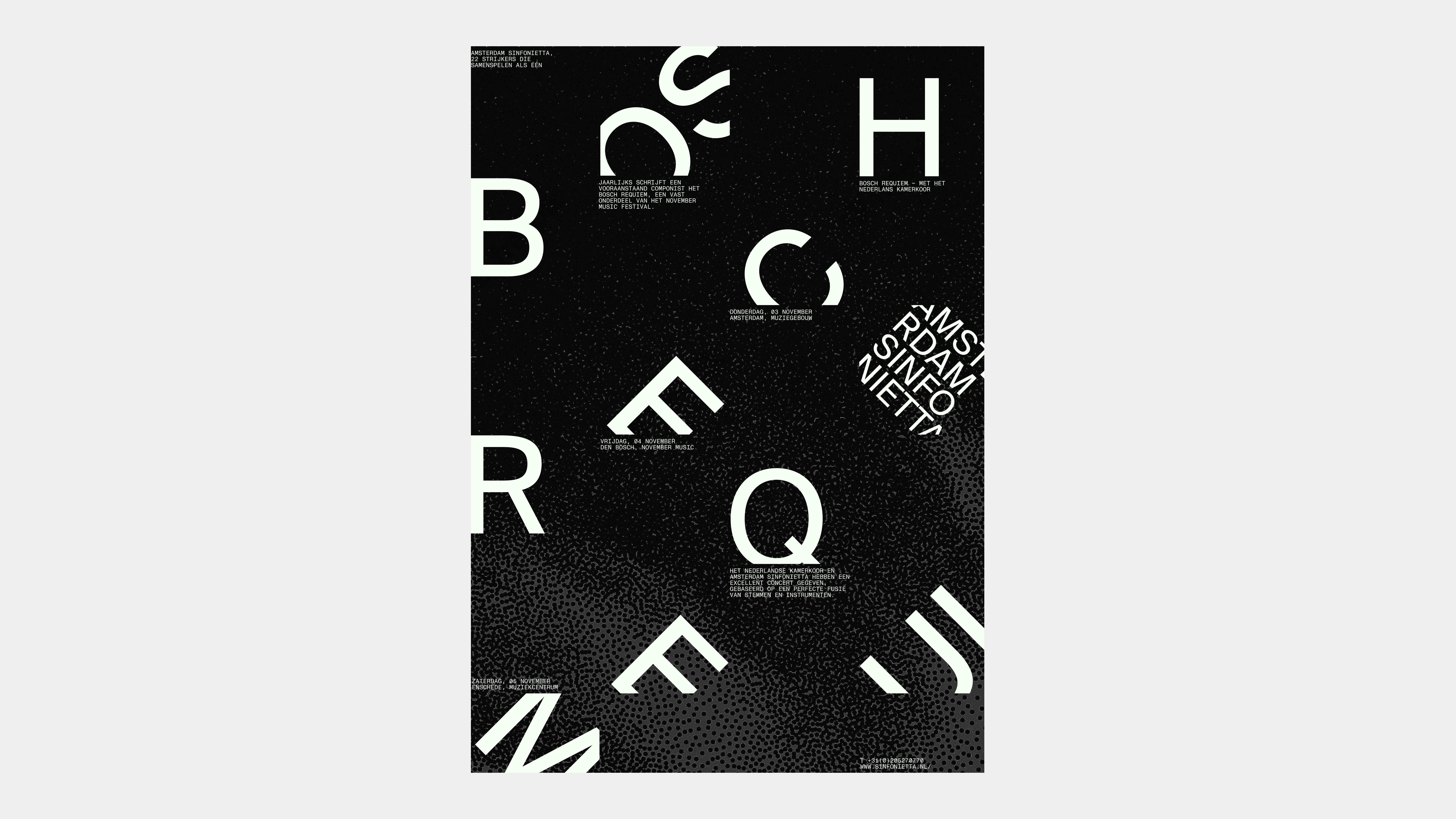
We transformed our visual identity into an expressive microsite that highlights the previsit and promotional stage of the event. We leveraged the Bosch Requiem’s identity as a highly anticipated annual performance to boost the appeal of attending to a person looking for performance information. For an in-detailed breakdown, please look through our Final Slide Deck.